
NOTE: This is content from the web re:Brand posts going back to November 2010. We have kept the re:Brand posts as a legacy archive but, on a go forward basis as of October, 2011, the new DATA eh? content takes over this space.
Chicago is getting the word out about their "new" web: http://www.cityofchicago.org/city/en.html
Lots of nice things happening there. What do you think and how would you like to see toronto.ca adapt/adopt from their efforts?

I like these things about the front page:
The example is also inside bullet points and seems to negate one of the advantages of using a list - to set the page free of clutter. It's also from a media release page (but linked off of the front page). As a non-media person, I would much rather read about such news in a non-news release format. Why not make the page speak to me vs. media?
Speaking of which can you imagine media reporting all of the items in the bullets? No way. Too much information perhaps for us all. Drop the full details into another layer so the research geeks who want that much can get it but I'm not saddled with plowing through it.
Even the headline is a mouthful:
What say you?
So that's some personal opinion. I tend to focus on content vs. the look and feel since the content (and what it says to me) is most important. I do like the look and feel (for the most part) of their pages - especially because I am not overwhelmed by any one thing. It's a pretty straight drive to get to where you want to go.
Love to hear what you think and what you think we could take from the "new" Chicago web.

10/2010
Chicago is getting the word out about their "new" web: http://www.cityofchicago.org/city/en.html
Lots of nice things happening there. What do you think and how would you like to see toronto.ca adapt/adopt from their efforts?
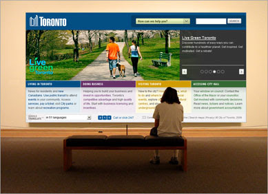
Chicago's new website
I like these things about the front page:
- front page lean and mean but clear
- decision points use intuitive language
- not overwhelmed by huge visuals but tasteful blend of text and image
- search works well on a few tests
Once inside:
- nice use of layering off information
- I like lists and they like them too
- unique presence for visitors
Surprised:
- use of images isn't consistent in size and placements at inner levels
- link back to Chicago main site from visitors kind of buried
- separate browser windows open for links to residents, visitors etc (maybe that negates the link back)
- good discipline in not overloading things like "what's new" with hundreds of items
- bureaucratic writing
Here's an example of what I mean by bureaucratic writing:
This is taken from: http://mayor.cityofchicago.org/mayor/en/press_room/press_releases/2010/march_2010/0311_ex_offenders.html
- In partnership with the non-profit groups Breaking Ground and the Safer Foundation, the City is using $4.6 million for a two-year program to provide job training and temporary jobs for about 140 formerly-incarcerated persons to take part in a new building “deconstruction” work program. In this program, city-owned buildings are taken down in an environmentally sound way that salvages the materials for re-use in the building industry. Breaking Ground is already training 32 workers, who soon will be traveling daily to work sites where they are removing nails and salvaging lumber from dilapidated buildings. The program not only provides income and job training to the workers, but also helps create a new green “deconstruction” industry to Chicago.
The Boeing Company, as part of the City’s ongoing Recovery Partnership with Chicago’s philanthropic community, provided a two-year grant to the Chicago Workforce Investment Council to bring a leading deconstruction expert to Chicago to help the City design this program and to help Chicago build a market for deconstruction in the future.
- The City is using $3.75 million in American Recovery and Reinvestment Act funds for a two-year Neighborhood Clean-Up Initiative that will provide about 230 year-round jobs and job-training services to Chicago’s hard-to-employ populations, with an emphasis on the formerly incarcerated.
The workers will gain practical experience and marketable skills in vegetation control, debris removal and the cleaning of neighborhood commercial strips.- The City is using $7.425 million in federal economic stimulus money to create about 295 community-based green jobs for the hard-to-employ, including the formerly incarcerated, over the next two years.
The example is also inside bullet points and seems to negate one of the advantages of using a list - to set the page free of clutter. It's also from a media release page (but linked off of the front page). As a non-media person, I would much rather read about such news in a non-news release format. Why not make the page speak to me vs. media?
Speaking of which can you imagine media reporting all of the items in the bullets? No way. Too much information perhaps for us all. Drop the full details into another layer so the research geeks who want that much can get it but I'm not saddled with plowing through it.
Even the headline is a mouthful:
Chicago Uses $16 Million In Federal Economic Stimulus Funds To Create More Than 650 'Green' Jobs For The Formerly-IncarceratedI also notice they are using caps for all the words in their titles which differs to us. We haven't been able to get our content providers to be consistent with this practice however. Maybe Chicago just decided: if you can' t beat them join them? Or would it be: If You Can't Beat Them Join Them?
What say you?
So that's some personal opinion. I tend to focus on content vs. the look and feel since the content (and what it says to me) is most important. I do like the look and feel (for the most part) of their pages - especially because I am not overwhelmed by any one thing. It's a pretty straight drive to get to where you want to go.
Love to hear what you think and what you think we could take from the "new" Chicago web.
Helping to evaluate toronto.ca - this could be you
2 comments:
All in all I'm not terribly impressed.
A few things:
- Not sure what's up with the weird Vista swoosh background, but, generally speaking not much in this design I really like.
- I appreciate the shorthand list on the left side but how the heck do I know if I want to "get" or "apply for" a permit to have an event in the park.
- All of the Mayor Daley stuff seems to deny that in fact this is the whole city doing these things. Let's try to get the megalomaniacal impulse out of these things and recognize that it's the city doing these things, not the mayor.
- Pixelation all over the images, particularly the rounded corners, which are inconsistently sized. And please with the 'multimedia' clipart.
- No real visual hierarchy to tell me where to go.
- Insufficient contrast in many of the content boxes.
- What's up with the two search boxes on the front page? Are they actually different?
- I disagree with you about some of the lists. In particular this one http://www.cityofchicago.org/city/en/ofinterest/bus.html where I'm getting no additional context to what I'm going to find when I click on them. And let me tell you, that landing on this page after clicking "for businesses" on the front page, was not at all inspiring.
I could go on and on as I find far less redeeming here than you do. I think if you're looking for a model to work from, take a look at the government of Utah site or the VisitPhilly site. Good balance of resident services, connections to other agencies (tourism, arts, etc.). Using the mega dropdowns in the navigation makes it easier to understand the contexts of the links. Some of the interaction stuff is unnecessary, but at least they're giving some sense that it's not 2004 anymore.
Oh, and as far as the caps goes, it's just the 'capitalize' setting in the CSS. It has nothing to do with consistency from content providers.
Anyway, keep up the good work and the conversation and thanks for providing this space.
@Christopher - lots to consider and thanks for the differing view. CSS can regulate how the case will appear but we're not doing that here yet. There is some debate whether we should do so (regulate I mean - we're not debating the use of CSS). I can tell you I am in favour of locking stuff like that down since it forces consistency.
Post a Comment