
NOTE: This is content from the web re:Brand posts going back to November 2010. We have kept the re:Brand posts as a legacy archive but, on a go forward basis as of October, 2011, the new DATA eh? content takes over this space.
I'm heading out on assignment for the next few weeks so this is likely the last post while I'm out. People on the team are going to monitor any comments so don't let my absence deter you!
Thought I'd outline the 7 things we've identified as the major areas for improving toronto.ca ... lucky 7 you might say:
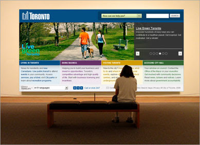
Look and Feel:
Our testing indicates 59% of respondents chose “Visual Elements” (e.g. graphic design, photos, and icons) to be the most important factors that could improve how people access information and services on the City of Toronto website.
Some user comments:
“The look is so "dry" - there is no enjoyment using the site… All looks like a big plain newspaper.”

Search
Our testing indicates that 71% of respondents chose “Search” as the most important types of services to offer on an improved City of Toronto website.
“Unless search words are nearly 100% accurate, few relevant "hits" come up.
"Allow users to find a person, service, facility, or city resources through a single search window; Currently search pulls a lot of old irrelevant content.”
"I would like to search for information on, for example, swimming pool hours without having to open and search through a pdf document. I live on the border between North and South districts so I sometimes have to search multiple pdfs because I am looking at locations in the two areas."
"You can't search for a report on a Council agenda unless you already know which Committee/year it went through.”
Navigation
Our testing indicates 65% of respondents chose “Links to services/information on other government websites”
Content
Timely updates are really important.
Some user comments:
Services
Our testing indicates that 42% of respondents chose “Requesting a City Service Online” (e.g. road repair, garbage pickup, tree work) and 39% of respondents chose “Paying Online” (e.g. bills, permits, tickets, fines, program fees) as the most important types of services to offer on an improved City of Toronto website.
Some user comments:
“Anything the City sells should be available to be purchased online
Accessibility / Customization / Personalization
Our testing indicates 30% of respondents chose “Accessibility” (e.g. text size, captioning, and screen reader use) the most important factors that could improve how people access information and services on the City of Toronto website.
32% of respondents chose “Non-English language options” the most important factors that could improve how people access information and services on the City of Toronto website.
“The City's web site needs to increase its accessibility features for residents with special needs and needs to increase the options for people who do not speak English.”
User Engagement
Our testing indicated that 40% of respondents chose “Communication” (e.g. email, newsletters, alerts, and blogs) as the most important types of services to offer on an improved City of Toronto website.
53% of respondents chose “Submitting suggestions and feedback” (e.g. via email, surveys, blogs) as the most important way that people could use an improved City of Toronto website to engage and interact with the City.
35% of respondents chose “Contact information” as the most important area where information on the City of Toronto website could be improved or presented differently.
Some user comments:
“Having online discussion forums, especially for public forum consultations would be a great way to involve more people in these discussions without incurring greater costs for booking larger rooms. Also this would be a way for people with Accessibility issues to take part easier in discussions without being restricted to only doing so at an accessible, i.e. Wheelchair Accessible, location. City needs to realize the full potential of its web presence…, and hopefully realize that by investing in a good web site that they can save money in other service areas.”

...Some things we are doing already. Some things will take a bit longer. I would be remiss not to note that this blog is our first step in using web 2.0 for a project as large as a rebranding of the web. You can help out by letting others know we are in play here. And, yes, please comment yourself.
Thanks,
See 'ya real soon.

11/2010
I'm heading out on assignment for the next few weeks so this is likely the last post while I'm out. People on the team are going to monitor any comments so don't let my absence deter you!
Thought I'd outline the 7 things we've identified as the major areas for improving toronto.ca ... lucky 7 you might say:
- Look and Feel
- Search
- Navigation
- Content
- Services
- Accessibility / Customization / Personalization
- User Engagement
What I want to do on my return is set up a post for each category so blog readers can go to any of these areas and provide focused comments right in the appropriate section. We're getting such uptake on the "cut to the chase" page, it sure seems likely that my ramblings aren't as important as just giving a comments space. Fine with me.
These links are on the top right side of the mighty blog for everyone too. For the full deal, allow me some license to write more here. Here's the 411 on how we arrived at the 7:
Look and Feel:
Our testing indicates 59% of respondents chose “Visual Elements” (e.g. graphic design, photos, and icons) to be the most important factors that could improve how people access information and services on the City of Toronto website.
Some user comments:
“The look is so "dry" - there is no enjoyment using the site… All looks like a big plain newspaper.”
“Looks like it was designed in 1999 for 640x480 screens.”
“The City's current website is pretty boring to look at - ultra corporate and uptight looking without any photographs or compelling visuals or design.”
“Design, design, design... Usefulness is not the only criterion. Your pride as a City employee should radiate in its design. The website should have some kind of character, just like the front page of a newspaper.”
All this is tied up in the design looking outdated, not very inviting, encouraging or inspiring and not exactly youth friendly.

Search
Our testing indicates that 71% of respondents chose “Search” as the most important types of services to offer on an improved City of Toronto website.
Some user comments:
“Unless search words are nearly 100% accurate, few relevant "hits" come up.
"Allow users to find a person, service, facility, or city resources through a single search window; Currently search pulls a lot of old irrelevant content.”
“Search function should return useable hits [not the zero or thousands and nothing in between]."
"I would like to search for information on, for example, swimming pool hours without having to open and search through a pdf document. I live on the border between North and South districts so I sometimes have to search multiple pdfs because I am looking at locations in the two areas."
"You can't search for a report on a Council agenda unless you already know which Committee/year it went through.”
“I should be able to use the search function on the City's web pages to find anything from by-law regulations to demographic to swimming classes.”
All this is tied up in search not finding information. A special reference to mapping being considered as search is significant. We need to display more specific information on a map, the application is slow and has a small viewing area.
Navigation
Our testing indicates 65% of respondents chose “Links to services/information on other government websites”
Some user comments:
“Take away the organizational structure and concentrate on the functions".
"Information should be organized by subject/service such as: taxes, water, trees, parks, parking, roads, transportation, etc, to make it easier to find, (and NOT under the name of the department that provides the services."
“Organize current events for specific groups - parents, teens, cultural, community events like children festivals, etc.”
This goes to providing easier access to information, grouping relevant information in one place and organizing content around topics and functions.
Content
Timely updates are really important.
Some user comments:
“It has become apparent to me that people do not trust the website/ or do not understand it. If they did we would not get lots of calls asking questions like: 'I just want to check if what I read was correct'"
“Have a news section on the homepage to highlight current, important events. Update it daily. Have strict parameters that outline what can and cannot be posted.”
“Cue groups or divisions to remove old information so that you don't run across a page that's from 2000 that hasn't been updated and has old, inaccurate information.”
This is tied into providing timely updates, archiving and removing old content,providing better content delivery and, even using multi media better. We also are being asked to provide more advice and suggestions to users - career development and better citizenship.
Services
Our testing indicates that 42% of respondents chose “Requesting a City Service Online” (e.g. road repair, garbage pickup, tree work) and 39% of respondents chose “Paying Online” (e.g. bills, permits, tickets, fines, program fees) as the most important types of services to offer on an improved City of Toronto website.
Once people used Online Services, 92% of them indicated that they would use them again.
In general, the users’ comments suggest that citizens would like to see new and more sophisticated online services made available, particularly in areas like bill/fine payment, permits and registration.
Some user comments:
“Anything the City sells should be available to be purchased online
"Ability to do payments online for all types of Services - pay bills, provide feedback, submit forms and request city services.”
“Have debit payments online.”
“Parking is one service that NEEDS online services to allow people to be able to pay bills online. They should also have the ability to dispute tickets online and to arrange for a date in court online, as currently they must either come in person or mail in a request to fight the ticket.”
“Why don't you allow online payment of property tax bills?”
“You should be able to get a history of your property taxes online without having to go to a municipal building, wait inline and pay $5 per statement."
This is tied into automating services with a single log-in for easy registration and payments.
Accessibility / Customization / Personalization
Our testing indicates 30% of respondents chose “Accessibility” (e.g. text size, captioning, and screen reader use) the most important factors that could improve how people access information and services on the City of Toronto website.
32% of respondents chose “Non-English language options” the most important factors that could improve how people access information and services on the City of Toronto website.
37% of respondents chose “Customization Features” (e.g. logging in, setting preferences, user profiles) as the most important factors that could improve how people access information and services on the City of Toronto website.
Some user comments:
“The City's web site needs to increase its accessibility features for residents with special needs and needs to increase the options for people who do not speak English.”
“I believe strongly that every single page fails W3C validation, sometimes multiple times due to simple errors such as a lack of ALT image tags, no Document Type descriptions… Unacceptable for a government website to have this many W3C Accessibility errors in 2007.”
“There's really no reason that most of the documents published as PDFs and can't be published as plain HTML files with an option to produce a PDF for printing if necessary.”
“e-mail notification of events, activities etc based on preferences.”
This ties into sorting out full compliance with W3c standards, providing more translations, offering the ability to get updates,delivering more choices and options.
User Engagement
Our testing indicated that 40% of respondents chose “Communication” (e.g. email, newsletters, alerts, and blogs) as the most important types of services to offer on an improved City of Toronto website.
53% of respondents chose “Submitting suggestions and feedback” (e.g. via email, surveys, blogs) as the most important way that people could use an improved City of Toronto website to engage and interact with the City.
35% of respondents chose “Contact information” as the most important area where information on the City of Toronto website could be improved or presented differently.
Some user comments:
“Having online discussion forums, especially for public forum consultations would be a great way to involve more people in these discussions without incurring greater costs for booking larger rooms. Also this would be a way for people with Accessibility issues to take part easier in discussions without being restricted to only doing so at an accessible, i.e. Wheelchair Accessible, location. City needs to realize the full potential of its web presence…, and hopefully realize that by investing in a good web site that they can save money in other service areas.”
“I believe that things like blogs where people can start their own threads to discuss various issues are very important. This will allow for the public to voice their opinions and at the same time provide feedback on the issues for the city employees.”
“Many citizens do not know about opportunities for public consultations. These opportunities (including online opportunities) should be highlighted. For every public meeting (e.g. community input on budget, there should be an online opportunity to solicit comments). A lot of people are unable to attend meetings. Citizens should be easily able to submit comments and feedback to the City, and receive a prompt response from appropriate staff.”
“I think communicating online is important, but please do not take away the other methods of communicating with the City e.g. phone, letter mail, etc.”
This is tied to having more web 2.0 features with online discussions and allowing feedback and e-contacts.

And so
...Some things we are doing already. Some things will take a bit longer. I would be remiss not to note that this blog is our first step in using web 2.0 for a project as large as a rebranding of the web. You can help out by letting others know we are in play here. And, yes, please comment yourself.
Thanks,
See 'ya real soon.


